21.10.10
20.10.10
Checkland Kindleysides
I made this series of illustrations and film for the design consultants Checkland Kindleysides.
Each illustrated an aspect of their expertise for the Creative Knowledge section of their website.
Thanks to Rasmus Norlander for his photographic magic.
Creative Knowledge film. Animation Pete Mellor
18.10.10
with Chrissie
Before IYC, Chrissie and I had worked on a couple of things before. This was for an exhibition with Peepshow quite a while ago now. One part of my work was displaying some of my collected ephemera. Chrissie created large scale versions.
Another - Hallowe'en fashion story in Complex magazine.
Photography John Short
13.10.10
new friends
Our final line up.
The way I approached it was not to have an idea of a 'body' but more about making nice combinations of the materials we found. Some were simple, some more complex. Floating shapes within the entire composition and areas of detail.
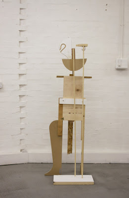
I was really interested in walking the line between figuration and abstraction - to keep things semi-recognisable while not giving in to the point when it 'becomes' something else.
We had an idea that they would be viewed from all sides, so when construction started, it was interesting to work on one area, and then walk around it to see what happened with the decisions you just made on the other side. I don't think my set are particularly 3dimensional in this respect - they are all quite flat on all sides.
Although i wanted to refrain from anything too figurative, i couldn't resist with this one.
Again, the placement of features/bodily bits move around so that there is never one definitive reading. If the triangle is a hat, then the circles are eyes, but it the triangle is a head then the circles are breasts etc.
A snippet of our catalogue contribution featured on It's Nice That.
IYC WIP
Chrissie and I both wanted to develop our already tried and tested ways of working. Our practice does overlap here and there and we both find that there is a common interest in creating objects but also the need to photograph them, and thinking in turn about what the actual outcome is - the thing or the image?
To move things on we spent some time gathering as much scrap material as possible from friend's workshop bins. The idea was to work in a similar way to our smaller kit of parts, but this time play on a bigger scale.
The nicest thing was to come to these pieces as an outsider given they already had a bit of a history - a joint that had gone wrong, an offcut from a more important shape. A bit like a puzzle to be made sense of in material terms alone.
Although we decided we wanted to create structures/figures, I instinctively wanted to arrange the pieces according to material, colour, shape etc. It would become something else to have gone down that route in this context, but something to explore another time.
IYC - wooden rod, rubber bands, foam balls
I was invited by Chrissie MacDonald to work with her on the project If You Could : Collaborate last year. It was fun to start from scratch and use the opportunity to re-visit old ideas and research that had not been yet realised.
We set up camp in the Peepshow studio and started by pooling a 'kit of parts' - wooden rods, pulp balls, lollipop sticks, pegs etc - and began making little studies of these materials. Some became figures, some remained ambiguous. The vague idea was to create patterns,objects, constructions and to see where our experiments would take us.
Some figures and material investigations.
12.10.10
more heads in bodies
11.10.10
7.10.10
5.10.10
drawn thread work
Started by making these sketches for a line up. It's a typical technique for me - using a cut out body template which is laid over images, drawings, objects etc, but on this occasion there was more thought with the initial placement; the first outfit is determined by placing the tattooed face where a real face would be.
The rest of the pattern falls onto the shoulders and torso.
The next and subsequent outfits are enlargements of the face and it's placement moves around the wearer's body.
The idea is that as the image grows, so will the textile treatment.
For starters, a fine-line screen print, then other techniques exploring different qualities of line.
Modelling clay applique (although it looks very much like cake icing). Liked this technique a lot - worked the clay into 'snakes' and then manipulated it into the shapes. It was a lot like drawing but quite difficult to translate the original layout of the line exactly. So the 'hand' is quite evident in all of this, like it is in the original.
Appliqué - fabric cut up into strips, then torn in half, giving one cut edge, one torn edge to each. The process of stitching took 3 weeks, on and off.
A really enjoyable process, again like drawing with a 3D line. It was also nice that there was a definitive end point. The challenges and satisfaction came in controlling the line when turning a corner.
As well as a different treatment, the garments construction grew in complexity. The drawing itself dictated the shapes within each outfit, so the neck falling below the hips became pockets. The face also took on different forms as it was abstracted. Above a detail of the carved wooden mask/necklace.
Layers of towelling used as edging. Again, the shape of the outfit is determined by the drawing;this being the nose area translated as an open jacket piece with layered top underneath.
The final garment in the series needs a bit of revision, so will post it when I've had a re-think and a re-make.